This was an AI recruiting product, not a component gallery. Evidence, confidence, and human approval had to stay the same in design and code.
The system grew out of a trust problem.
Ranked candidates arrived fast. Recruiters still could not explain why. Principle: AI does the work; the recruiter owns the call.
I systemized what survived real use.
I started from recruiter flows, not a button inventory. A pattern entered the library only after it survived testing, the API, and a real workflow.
Meaning first, then style.
Blue is action. Purple is AI reasoning. Neutrals carry evidence and status. One icon language keeps dense recruiting screens scannable.


Visual rules became component contracts.
Figma was not a second set of screens. Repeated decisions became foundations, components, and patterns — one path from a visual rule to a typed React prop.
Audit the product. Keep what already survived recruiter workflows.
Bind foundations. Color, type, spacing, grid, elevation — via Auto Layout.
Expose the contract. Size, state, intent, loading, selection as named properties.
Return to the flow. Swap local UI for library instances and check they still hold.
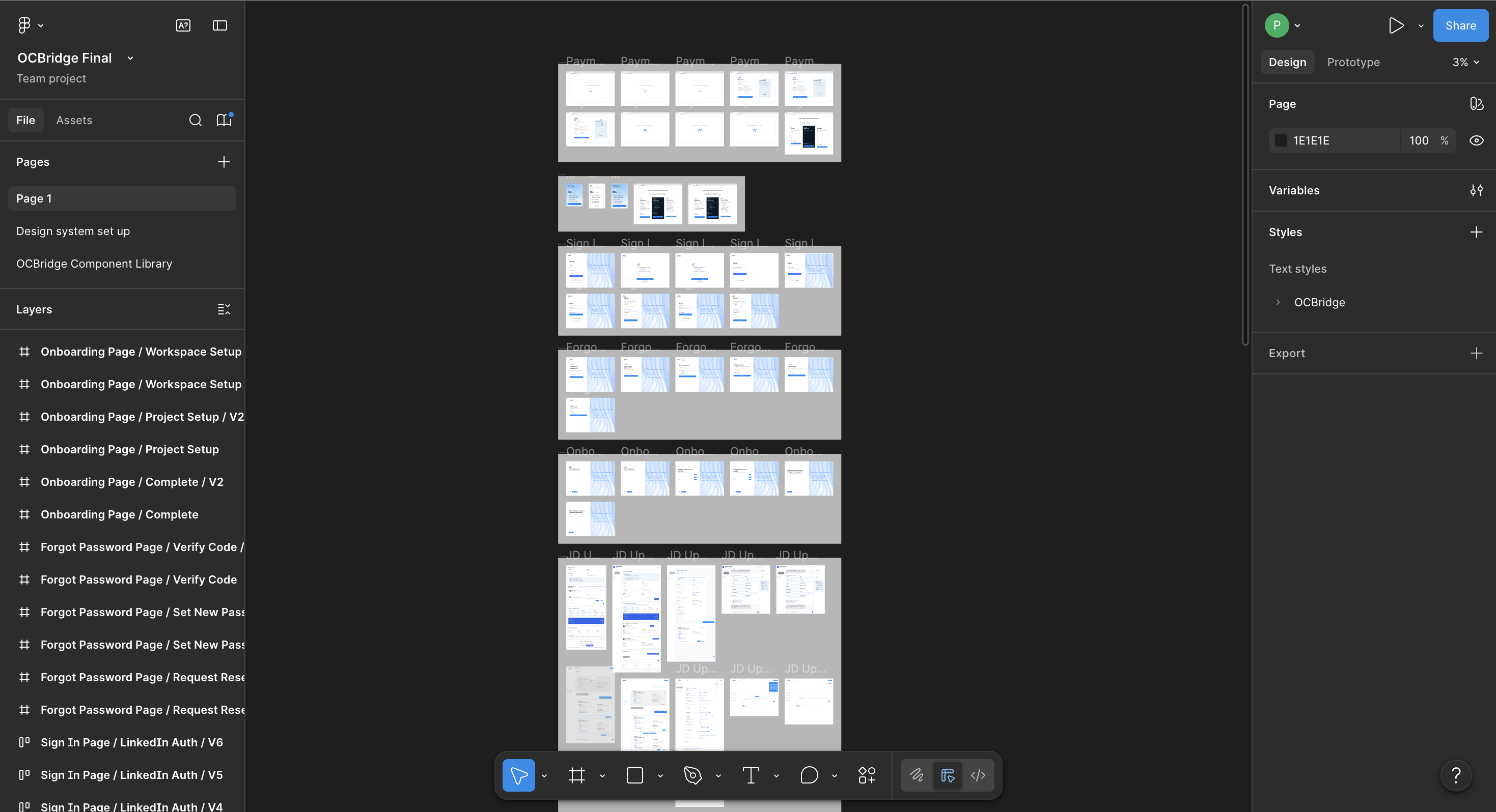
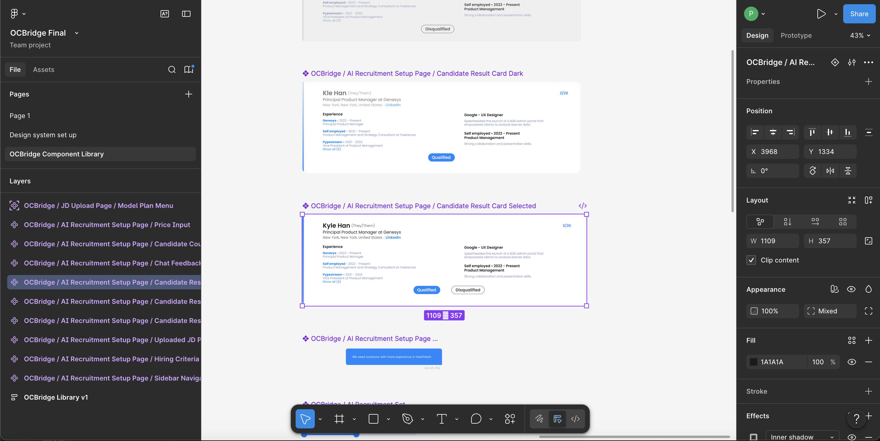
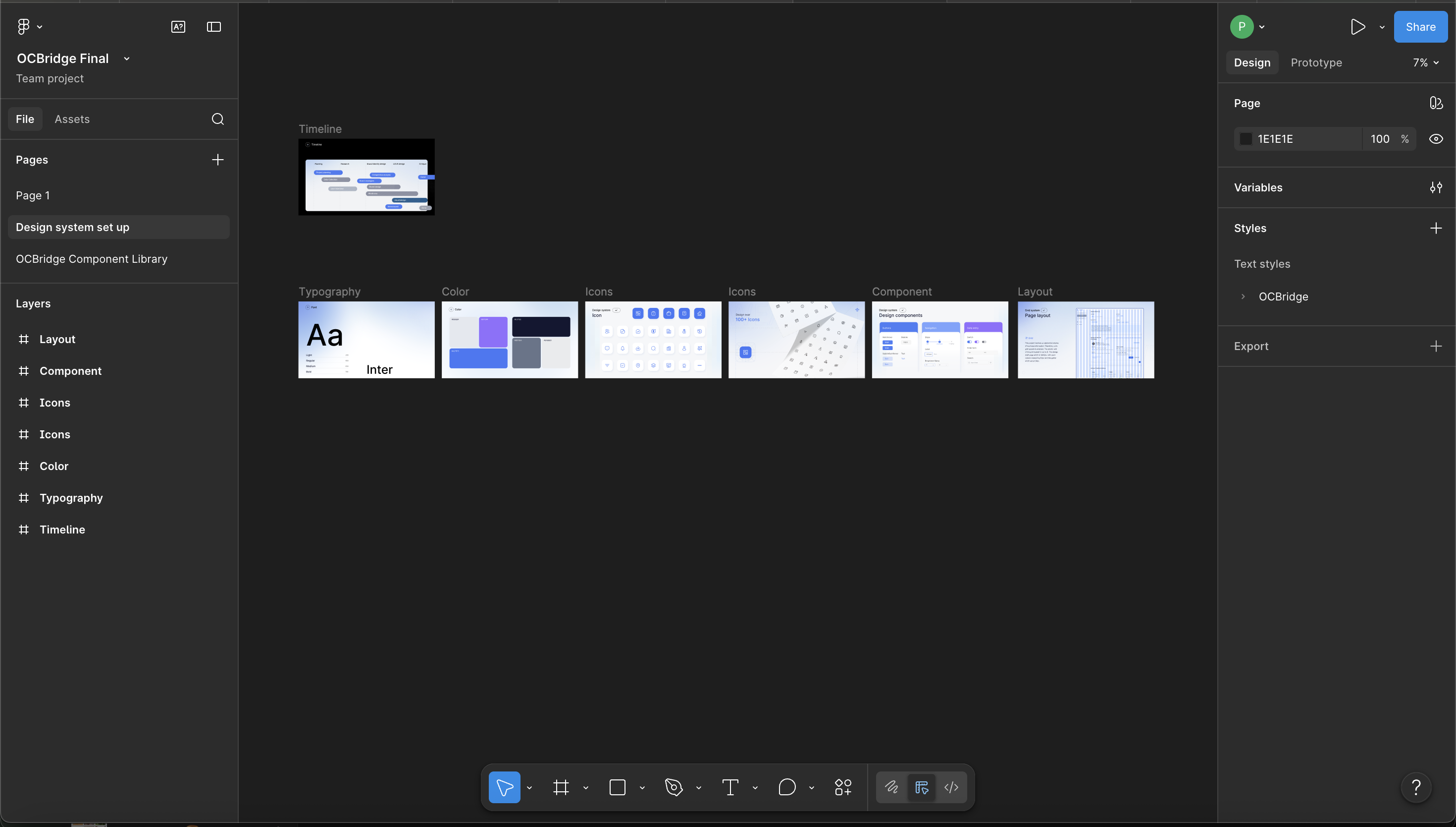
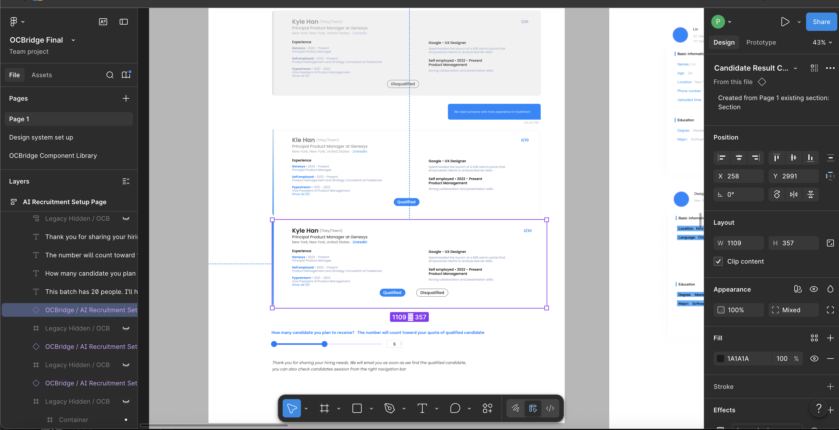
Click a stage: file structure → components → product.
Next: orchestration on the project we already share.
Product, Design, and Frontend already work in one Git project. What’s missing is an agent that can read context, move between Figma and Web, and sync back.
This layer does not replace the current workflow. It reads the same evidence and returns changes to the source Product, Design, and Frontend already own.
Every semantic token traces back to a product decision.
Shared names were not enough. Blue is a human action; purple is the AI’s voice. Those roles went from research → Figma variables → --oc-* CSS used by React.
attention, primary, and confidence tiers.
--oc-color-primaryHuman actions and deliberate approval moments.--oc-color-attentionAI-generated reasoning that requires review.success / warning / dangerConfidence-dependent outcomes and feedback.Figma records the architecture. The CSS token file is the source of truth for shipped names.
Name by role, never by value. --oc-color-attention means AI reasoning. Purple can change without renaming anything.
Scale by decision. Radius is field, row, card, surface, or pill — a role, not a number.
Theme by attribute. data-oc-theme flips dark mode without touching a component.
Tokenize the invariants. Focus ring and motion are tokens too, so a11y is not re-decided per component.
:root, [data-oc-theme='light'] {
  --oc-color-primary: #1a6ee8;    /* interaction */
  --oc-color-attention: #9170ff;  /* AI reasoning */
  --oc-radius-card: 10px;
  --oc-focus-ring: 0 0 0 2px var(--oc-color-surface-raised),
                   0 0 0 4px var(--oc-color-primary);
}

[data-oc-theme='dark'] {
  --oc-color-primary: #85b7ff;    /* the name holds, only the value moves */
  --oc-color-attention: #bca9ff;
}Visual decisions became typed behavior.
Figma can show a loading button. It cannot stop a double submit or tie an error to a field. In React, each visual decision became a prop, a behavior, and a test.


selectedSelectedVisual baselinecandidateLongContentContent stress testactionsWithPipelineContextKeyboard + axeconfidence + sourceRendered metadataAccessible outputTyped props: variant, loading, disabled, removable, selected, tone.
Props become HTML semantics, visible states, focus, and the right ARIA.
Each state gets a story. Axe checks semantics; visual tests catch layout drift.
It ships when API, story, a11y, and screenshot agree.
interface ButtonProps extends ButtonHTMLAttributes<HTMLButtonElement> {
  variant?: 'primary' | 'secondary' | 'utility' | 'danger';
  loading?: boolean;
}

<Button loading={isSubmitting} disabled={!canApprove}>
  Approve candidate
</Button>

// Native disabled behavior + aria-busy + one tested visual state